GLUTEN FREE CREATIONS
Website Redesign


OVERVIEW
This project involved redesigning the website of a gluten-free bakery, focusing on improving its information architecture, user flow, and visual design through comprehensive user research.
The goal was to create a data-driven, user-centred experience that addressed key usability issues while better supporting the needs of users searching for gluten-free products. The redesign aimed to improve navigation clarity, highlight important dietary information, and deliver a more intuitive and engaging browsing experience.
my role
UX/UI Designer & Researcher
Timeline
16 weeks
TOOLS


CHALLENGE
The original website suffered from poor navigation, unclear information hierarchy, and inconsistent visual design. Users struggled to find key content, complete tasks efficiently, and understand the site’s purpose, leading to frustration and drop-off.
SOLUTION
I redesigned the site’s structure and interface using research-driven insights. By simplifying navigation, improving content organization, and creating a cohesive visual system, the redesign provides a clearer user journey, reduces cognitive load, and supports faster task completion
MY DESIGN PROCESS
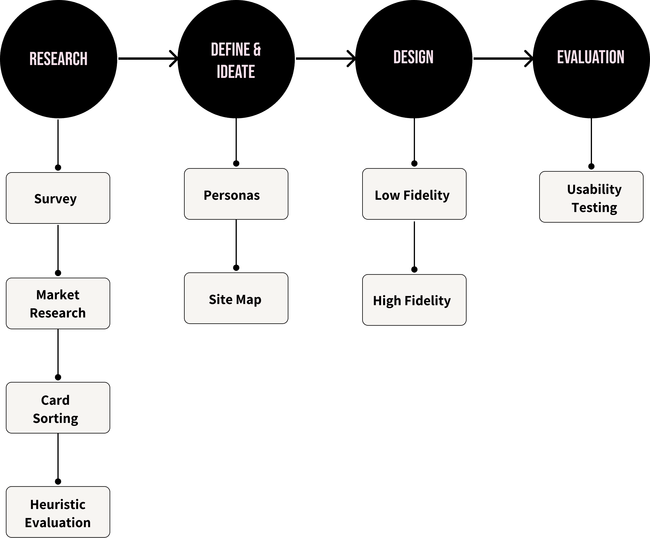
RESEARCH
Evaluating the Existing Website.
Competitor Analysis


Only gluten-free bakery websites were analysed to maintain relevance and ensure insights reflected the expectations of users specifically searching for gluten-free products.
Flip for key insights →
Heuristic Evaluation


Freedom and Controls
Help and Documentation
Consistency and Standards
Aesthetic and Minimalist Design

The heuristic evaluation revealed insights across each of the usability categories shown above. All four categories received moderate to low scores, indicating several opportunities for improvement.
Flip for key insights →
User Research.
Surveys

Surveys were used to construct personas for this redesign.
54.5% of participants typically purchase gluten-free products online
55% of respondents value easy website navigation
55% purchase food online 4-8 times a month
63% of participants were females.
Improving Navigation.
Card Sorting
To simplify the existing website’s overwhelming navigation, an open card sorting exercise was conducted with participants that matched the previously defined personas.
The activity revealed clear patterns in how users grouped products, which informed a revised navigation structure. Four main categories consistently emerged:

User Groupings informed the new sitemap.
DEFINE & IDEATE
Insights from research were synthesised into clear user needs, which informed the development of personas and a simplified site structure.
Personas.
Personas were created based on survey data to represent key user groups. They helped identify common goals, frustrations, and behaviours, ensuring design decisions remained user-focused.
I have a lot of dietary restrictions so clear nutrition information helps.
“
”
Mia Baptise
31 years old


Full-time worker
She/Her
Arts & crafts


Goals
Technology Skills
Food Sensitivities
Hours spent online
Familiarity with GFC
Frustrations
Clear menu options
No/ unclear ingredient info
Wrong deliveries
Simple checkout process



I have a lot of dietary restrictions so clear nutrition information helps.
“
”
Vince Larson
44 years old
Full-time worker
He/Him
Watching TV
Goals
Technology Skills
Food Sensitivities
Hours spent online
Familiarity with GFC
Frustrations
Easy website Navigation
No good options


Sitemap.
The sitemap was restructured based on card sorting results, simplifying navigation into four primary categories and improving content discoverability.
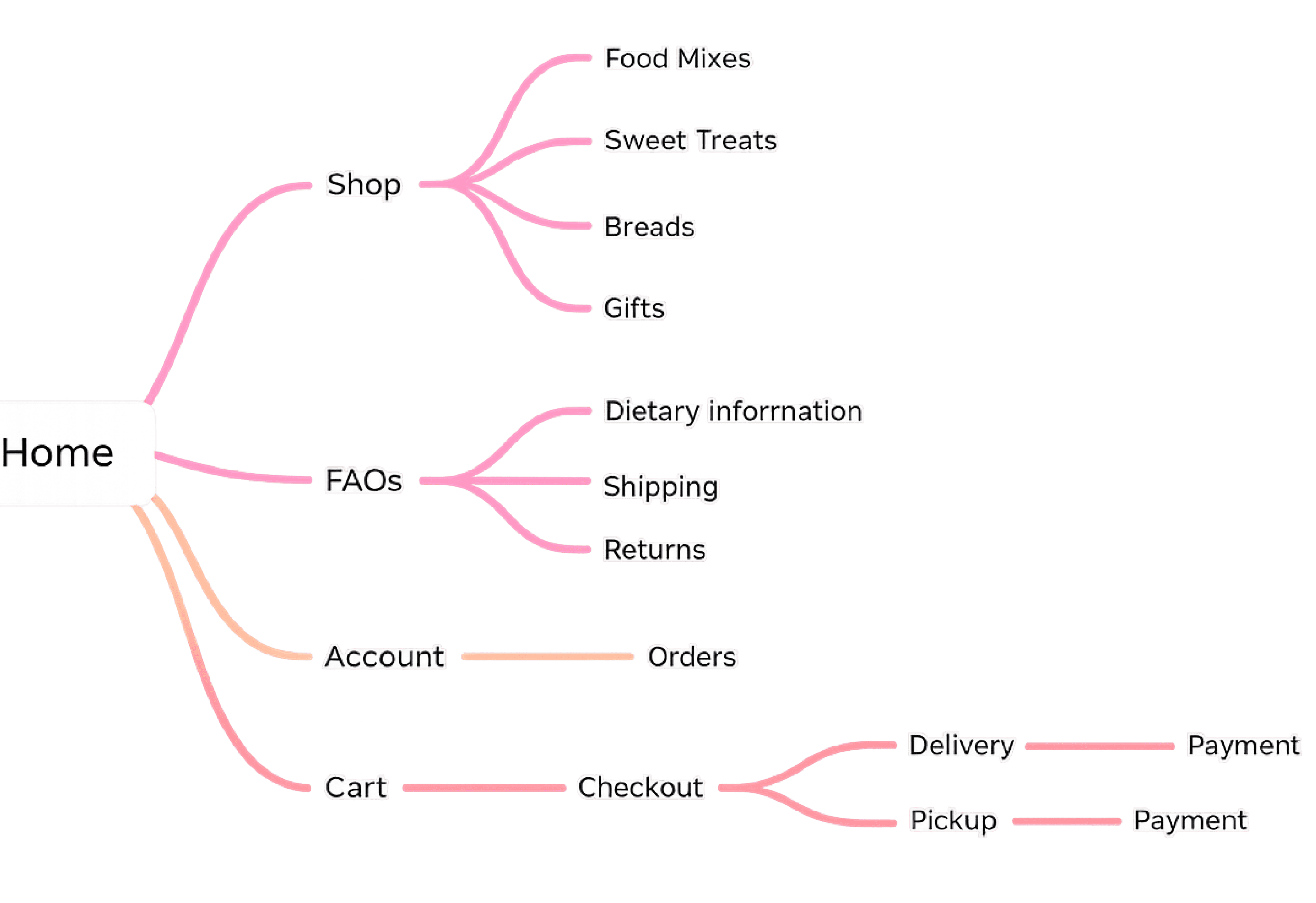
Together, these outputs translated research insights into a clear information architecture that informed the subsequent wireframes and design.
design
The design phase translated research insights into a clearer navigation structure and a more streamlined purchasing flow.
Low-fidelity.
Low-fidelity wireframes explored layout structure and navigation flow based on insights from the card sorting exercise and heuristic evaluation.

high-fidelity.
Building on this structure, high-fidelity designs refined key interactions across the browsing and purchasing journey to improve product discoverability and reduce checkout friction.

Cart
The navigation structure was streamlined based on card sorting results, consolidating product categories into clearer groupings. Dropdown menus were introduced to improve discoverability while keeping the interface visually simple.
Placing the cart prominently in the header ensured users could monitor selections throughout the browsing process.
product overview
A slide-out cart overlay provides immediate confirmation when items are added, supporting visibility of system status without interrupting browsing.
Users can review totals and proceed to checkout directly from this panel, reducing unnecessary navigation steps.

Home page
The navigation structure was streamlined based on card sorting results, consolidating product categories into clearer groupings. Dropdown menus were introduced to improve discoverability while keeping the interface visually simple.
Placing the cart prominently in the header ensured users could monitor selections throughout the browsing process.
product catalogue
Product cards were redesigned so the entire container functions as a clickable interaction area, reducing precision demands and supporting faster browsing behaviour.
nline expansion allows users to preview product details without leaving the catalogue page, maintaining navigation continuity.

checkout
The checkout experience was simplified into a single structured layout containing contact, delivery, and payment sections, reducing cognitive load during purchase completion.
Delivery and pickup options dynamically reveal relevant form fields, preventing users from processing unnecessary information.
order confirmation
A confirmation screen was introduced to provide clear feedback after checkout, supporting visibility of system status and reassuring users that their order was successfully processed.
A prominent return-to-home action allows users to easily continue browsing after completing their purchase.
next steps
To ensure the success of the redesign, the next step would involve testing the updated interface with a significant sample of real users.
This process would gather valuable feedback on usability, functionality and overall user satisfaction. Insights from these tests could help identify any painpoints or areas for improvement, enabling further refinements to enhance the user experience and better meet customer needs.