skin rituals
E-commerce experience for skincare discovery and purchasing.

OVERVIEW
This project explored how an accessible healthcare appointment booking system could support older adults in scheduling appointments more confidently. The interface was designed from scratch using accessibility-informed interaction patterns to reduce cognitive load and improve scheduling clarity.
my role
UX/UI Designer & Front-end Developer
Timeline
13 weeks
TOOLS



CHALLENGE
Online skincare shopping can be overwhelming due to large product catalogues, unclear product information, and complicated checkout experiences. The goal was to design an intuitive shopping experience that helps users discover products and purchase confidently.
goals
Simplify product discovery
Improve product comparison
Increase checkout confidence
Maintain a premium skincare aesthetic
my design process
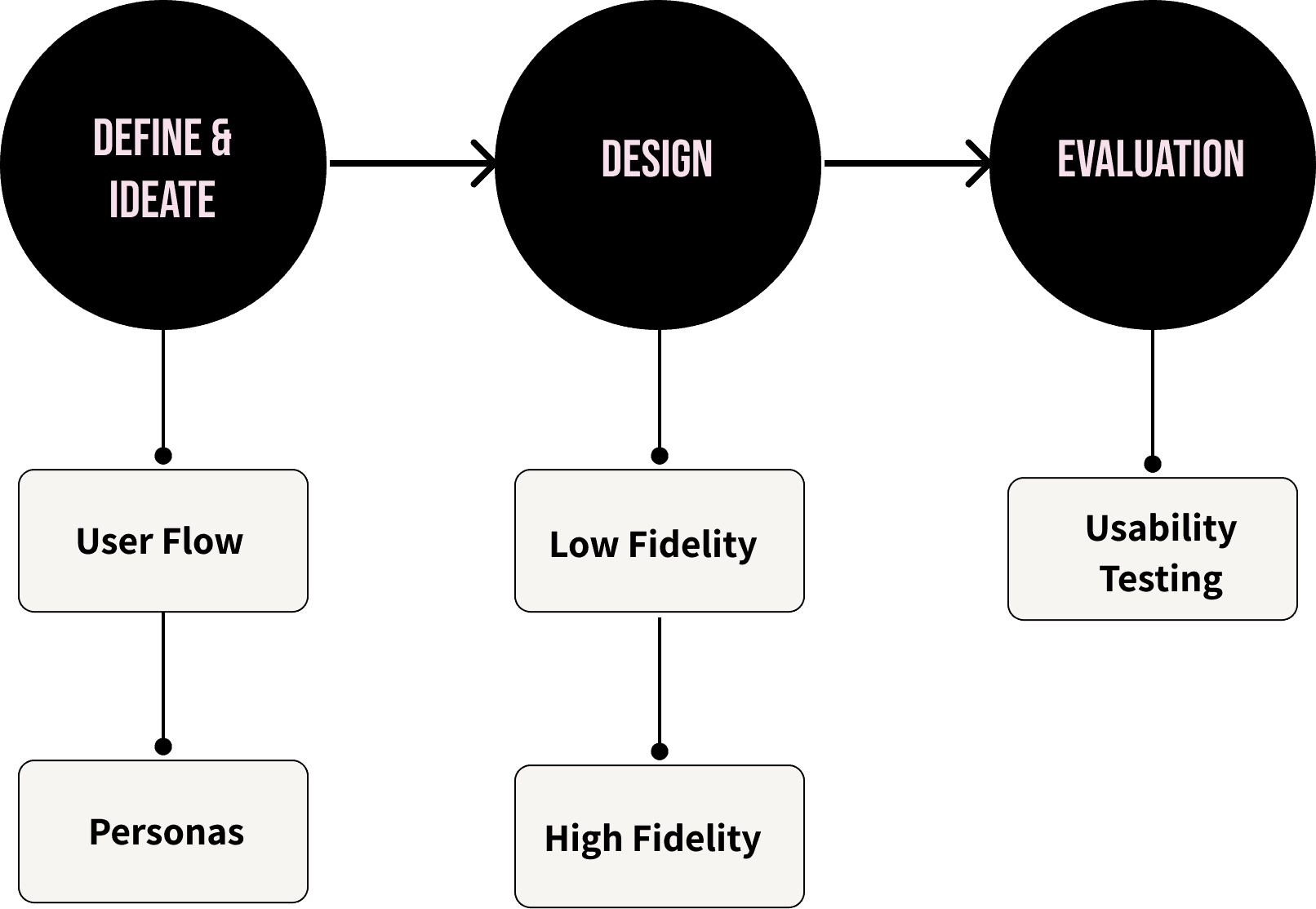
Define and ideate
personas
Two primary personas were developed to represent users of differing levels of digital confidence, ability and needs. These personas informed key design decisions around readability, navigation simplicity, product information and error prevention throughout the purchasing process.
I have a lot of dietary restrictions so clear nutrition information helps.
“
”
Nicole Diez
24 years old

Technology Skills
Frustrations
Icons without clear labels or explanations
Slow checkout processes
Sites requiring account creation
Values
Fast, clear buying process
Simple navigation and product categorisation
Accurate, upfront product information

Marketing exec
She/Her

I have a lot of dietary restrictions so clear nutrition information helps.
“
”
Rob Torres
38 years old
Technology Skills
Frustrations
Overly complex visuals / animations
Unclear product descriptions or missing information
Difficult navigation paths
Values
Simple, predictable layout
Clear and detailed product descriptions
Clean design

Teacher
He/Him
user flow
The seamless shopping experience that guides users from product discovery to purchase with clarity and confidence

design
The design phase translated research insights into a clearer navigation structure and a more streamlined purchasing flow.
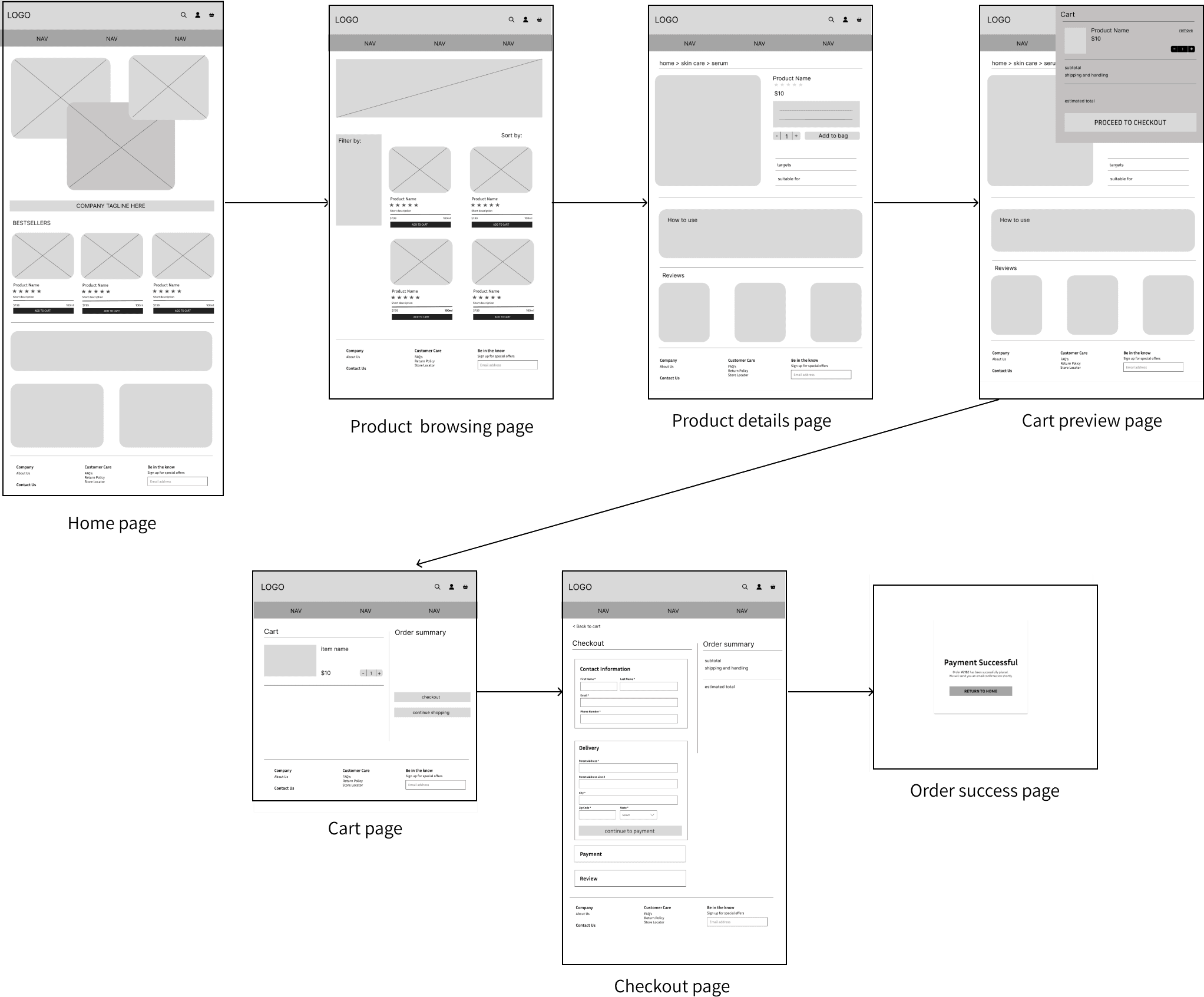
Low-fidelity.
Low-fidelity wireframes explored layout structure and navigation flow based on insights from the card sorting exercise and heuristic evaluation.
key design decisions
Key design decisions focused on simplifying product discovery, reducing shopping friction, building purchase confidence, and creating an accessible browsing experience.
reducing cognitive load
The browsing experience was simplified through clear product categorisation, generous whitespace, and a restrained visual hierarchy. This helps users quickly scan products without feeling overwhelmed


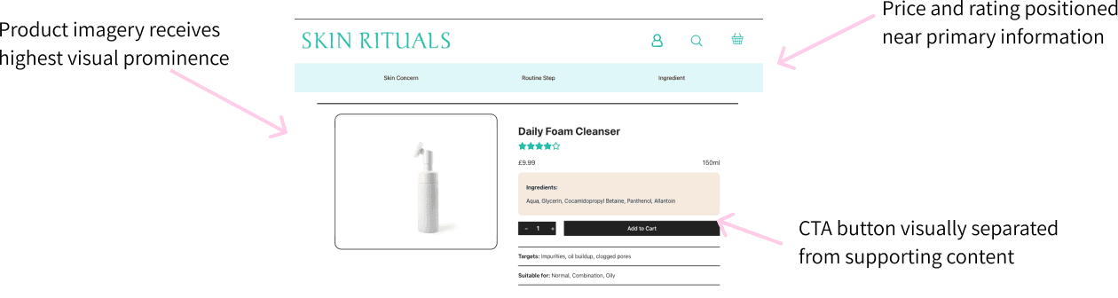
Clear visual hierarchy
Typography, content hierarchy, and layout spacing were used to guide attention from product discovery to purchase actions. Primary information is prioritised while secondary content remains accessible.

reducing checkout friction
Checkout interactions were streamlined to minimise friction and help users complete purchases efficiently.


Supporting user confidence
Product information was designed to reduce uncertainty and help users make informed purchasing decisions through transparent details and credibility indicators.


final design
The final interface combines research findings and iterative design decisions into a streamlined e-commerce experience that supports intuitive product discovery, informed purchasing, and a frictionless checkout journey.
Home page
Product details page
Cart review page
Checkout page
Confirmation page

what i learned
Designing Skin Rituals strengthened my understanding of how thoughtful interface design can simplify the online shopping experience. Throughout the project, I learned how visual hierarchy, information architecture, and clear interaction patterns influence user confidence and purchasing decisions.
This project also reinforced the importance of balancing aesthetic appeal with usability, ensuring the interface remained both visually engaging and easy to navigate.